Well hi, glad you’re here!

Makanalani Farms Product Labels
During my time at the Hawaii Leadership Residency on the north shore of Kauai, I was commissioned to design new, brand-refreshing labels for the organization’s line of organic, locally sourced, and locally produced goods! For the creative direction of this project, I knew I really wanted to capture the down-to-earth, artisanal, communal nature of the north shore while highlighting the elements and unique ingredients that come straight from the land and go directly into the products. These products are sold exclusively at farmer’s markets on the island, and the majority of customers are visitors and tourists. This is how I landed on making hand-drawn illustrations of the fruits and honeycomb to emphasize a more personal connection with the customers, showing them exactly what goes into the products. The high contrast of the charcoal grey and white color scheme keep the labels simple and easy to decipher while still giving that classic, old-style feel; a small call back to the island’s historical plantation days! In addition to the front labels, I produced back labels for the ingredient list as well as a QR code linked to the product line’s website.
I’m very grateful to have had the opportunity of this project!!


Torrey Conference 2023
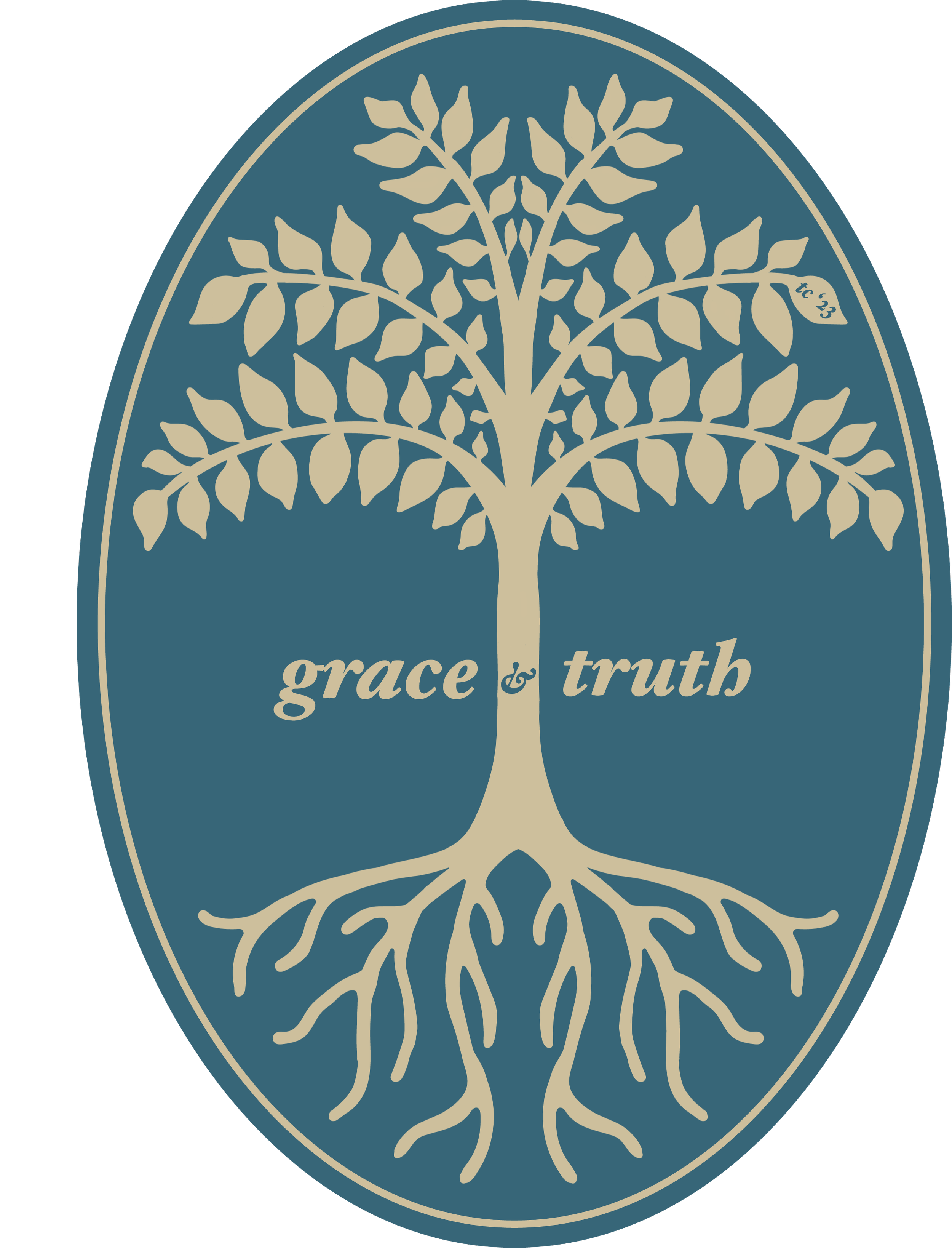
I had the pleasure of designing the logo mark and branding aesthetic for Biola’s Torrey Conference in the fall semester of 2023. Three initial mockups were presented to the client. Once a direction was agreed upon, the work towards a finalized logo, color palette, and typeface selection began , resulting in the finalized design that was used in the conference space, for apparel, stickers, banners, and other conference signage.


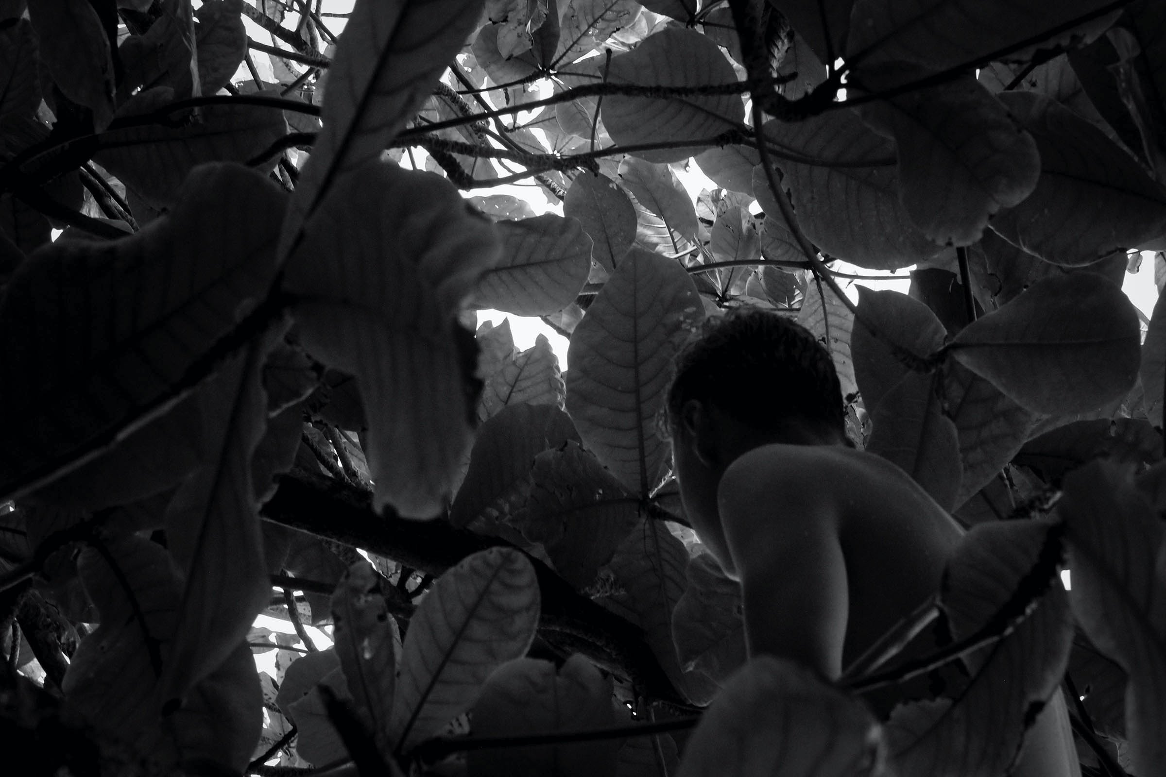
brother
Lorem ipsum dolor sit amet, consectetur adipiscing elit, sed do eiusmod tempor incididunt ut labore et dolore magna aliqua. Habitasse platea dictumst quisque sagittis. Quisque id diam vel quam elementum pulvinar etiam non.
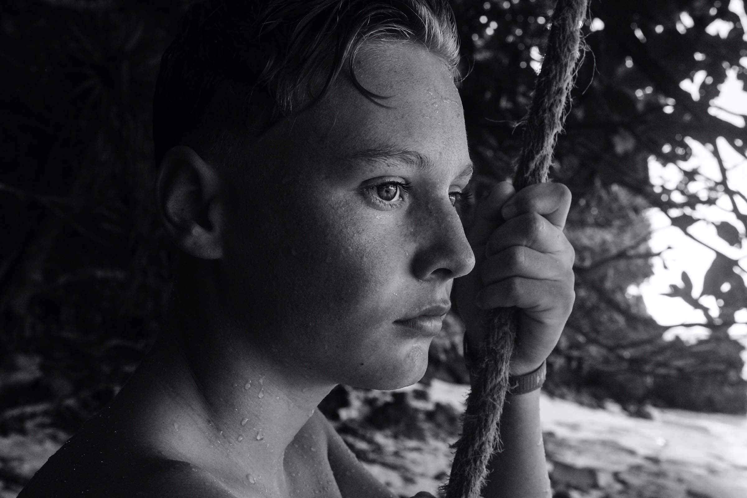
No one knows my brother like I do.
Sometimes I have friends that will tell me that my brother seems like a quiet dude, maybe even a little shy. If you don’t know him very well, he might even seem that way to you. But the jake I know is something super different. If you get the chance to spend more time with him, your picture of jake will get clearer. You’ll see that he is a huge goofball who loves life, Arizona iced tea, and is super good at annoying his sisters. In the first shot he is actually trying to hit me with the rope swing in his hand. It took a few tries to get him in the tree for the second shot because we both started laughing and fell over when he stepped up on my shoulders. By the time this third shot was taken, he just wanted to get back in the water and be done with pictures. Even though he’s pretty good at being an annoying little brother, he knows how to make me smile and never lets me be upset for too long. He is probably the coolest kid I know. If you saw him as a quiet guy before, I hope that this helped you get a clearer picture of who he is now.


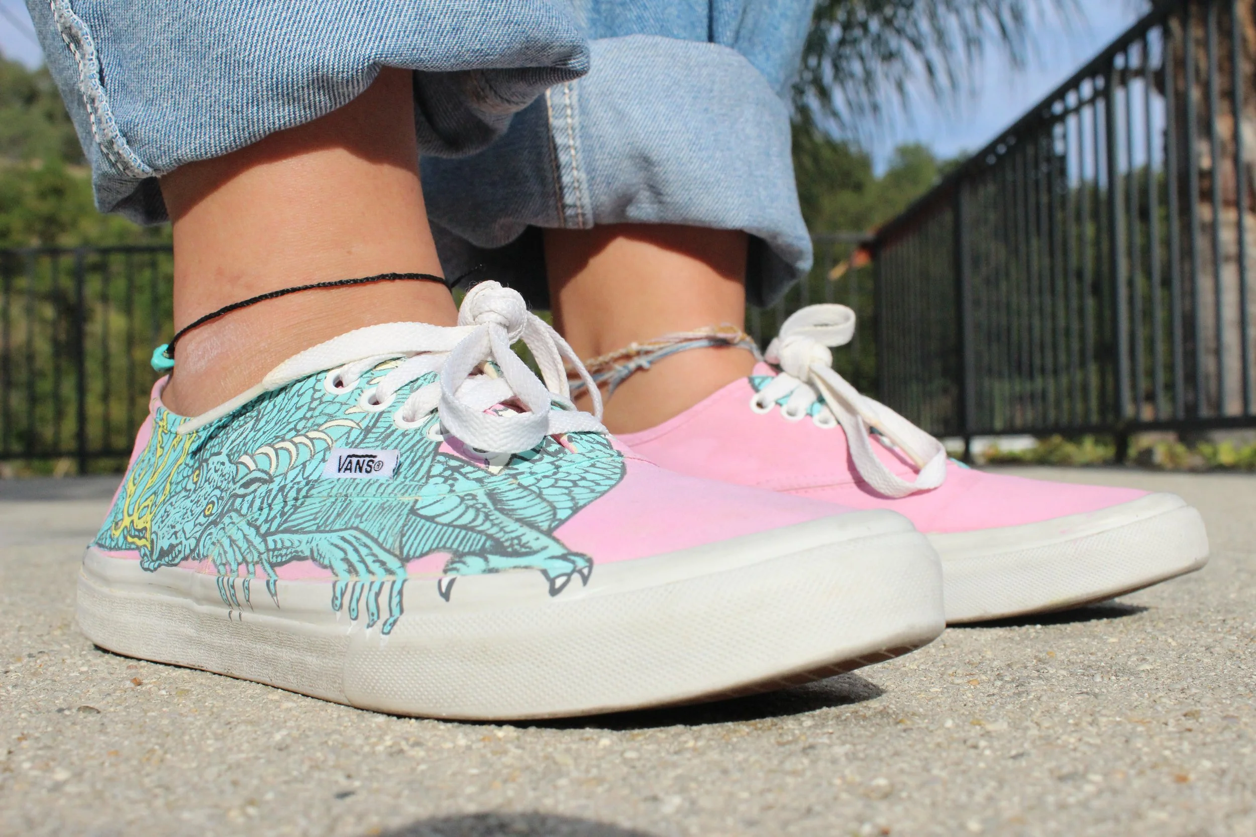
Scaled and Icy (Album Cover) Shoe

don’t you shy away.
.
Scaled and Icy - The newest album release by twentyonepilots was the influence for this piece . Both shoes are adorned with a hand-painted image of the character Trash the Dragon which is seen on the album cover of this record as well as trident-looking logo located near the heel that is also associated with the band.
This particular pair of shoes was bought second hand and then cleaned and treated to put them in the best restored state. The original color was a pastel yellow (with some stains) which was then covered over with this beautiful light pink hue, immediately giving the shoes a brand new feel. I love the idea of taking an item that has been discarded and giving it a new chance at life which is what started my love of custom painting pre-owned shoes.


Keith Haring Customs

Marking the beginning of quarantine in March of 2020, I found myself confronted with time. Now, how to use this time was a bit of a tougher question and how to use it well was even more tough. I began to watch youtube videos of an artist who would paint Nike Airforce 1’s and I was instantly hooked. I dug around in my room and found an older pair of white lace up vans that would be perfect for experimenting with. The inspiration for the design of shoes came directly from past work of Keith Haring, the New York based street artist, who happened to be my favorite artist at the time. I was inspired by his bold colors and the original characters that he produced.
This project opened a gateway into an avenue of art that I still pursue heavily today and have now evolved from painting shoes for myself to now taking commissions for custom painted shoes. Each pair that I produce brings exposure which has allowed me to work on other projects, collaborations, and commissions or private clients, companies, and church organizations.


Detour?

“where did you get a detour sign from??”
.
I had recently started promoting my custom promoted shoes when I received a direct message from a potential client with a slightly different idea in mind. He had received a metal detour sign and had been pondering over what to do with it. He saw my work that I had promoted and was intrigued. I was simply told that I had free reign as far as the design. Artists dream of being commissioned to produce an original design so I was very excited to work on this new type of canvas and eagerly accepted.
The process for this started by taking photographs of my own hands in the position that I desired and then sketching out those photographs. I then transfered those physical drawings into a digital graphic rendering (shown above) which was a new medium at the time for me. This helped me to be able to work with colors and figure out the style of painting that I wanted that is seen in the final piece.

